Working With Xibs And Storyboards
Table of Contents
In this entry, I’d like to explore the different ways we can interact with Xibs and Storyboards in our programmatic code. These files are present in many projects, so it’s important to understand the basics of how to work with them.
Let’s start with some definitions!
Definitions#
What are Storyboards#
Storyboards are like a big visual map in Xcode that lets you design your app’s screens. You can drag and drop things like buttons, labels, and images onto these screens to see how they’ll look. Plus, you can easily set up how the screens connect and move between each other. It’s like drawing out your app’s flow and layout so you can get a good idea of how it’ll all work together without needing to write too much code right away.
What are Xibs/Nibs#
Xibs, short for “XML Interface Builder,” are individual files in Xcode that help you design a specific screen or component of your app. Think of them as blueprints for smaller, reusable parts of your app’s user interface. Unlike Storyboards, which give you a big-picture view of your entire app, Xibs are focused on one screen or view at a time. You can visually arrange buttons, labels, and other UI elements in a Xib file, then load that design in your app to get a custom layout exactly how you want it. It’s a handy way to build specific UI pieces without touching too much code.
On the other hand, Nibs (short for “NeXT Interface Builder”) are essentially compiled versions of Xibs. When you design a user interface in Xcode using a Xib file, it gets converted into a more optimized format called a Nib file that the app can load at runtime. This makes the interface ready to use more quickly. In short, Nibs are pre-packaged user interface designs created from Xibs, enabling the app to load and use them efficiently when needed.
So, while you work on Xibs during development, your app uses Nibs when it runs!
Working with Storyboards#
Creating a new Storyboard#
When we create a new app with Storyboard, Xcode automatically will create a Main Storyboard. We can also create these files, here is how:
- Inside an Xcode project let’s press
CMD + Nand select storyboard in the presented window.
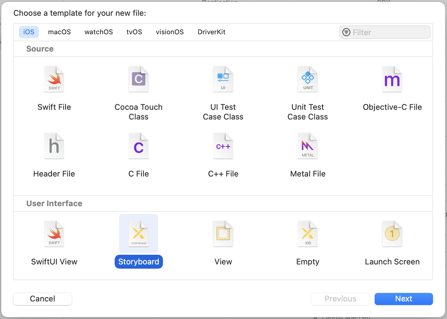
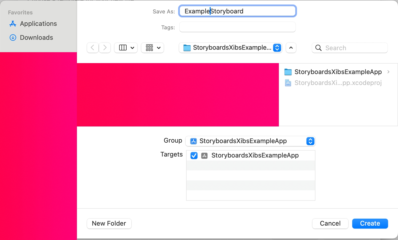
- Add a name for the new Storyboard, remember to add it to the correct Group and Target.
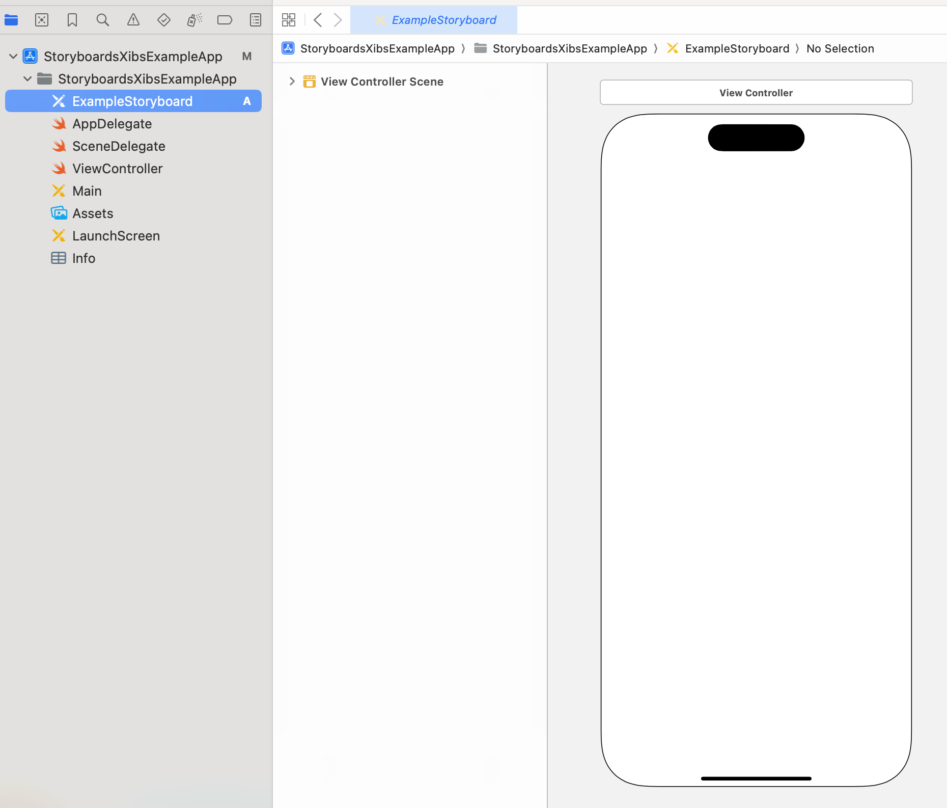
- The new Storyboard is ready to use in our project, add the elements you need inside the Storyboard graphically, no code is needed here.
Adding constraints to the Storyboard#
By default, new UI elements added to the Storyboard doesn’t know where they will be placed on the screen. To alleviate this we can add constraints to the elements in the screen.
UI elements can be seen as rectangles on the screen and the constraints tells these sides how to relate to other elements in the screen.
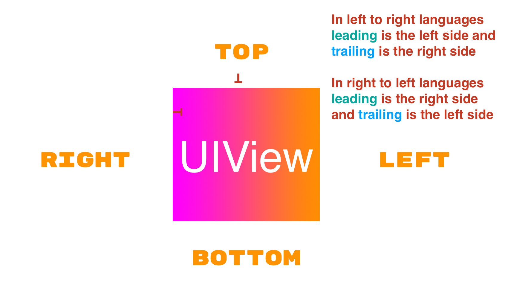
If the UI element is affected by the language orientation you should use
leadingandtrailing.
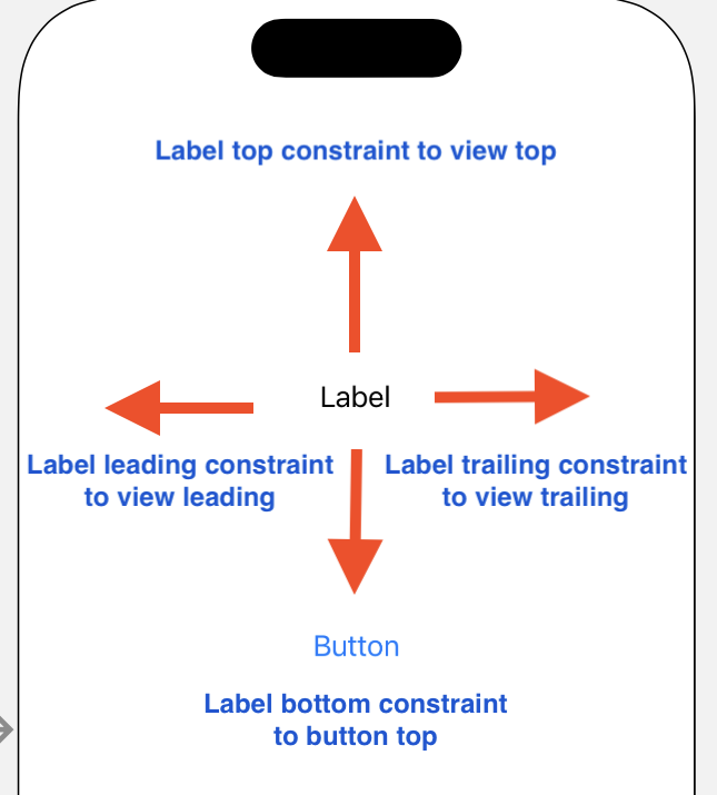
One key difference between programmatic constraints and visual constraints (those added in the Xcode Interface Builder) is that the latter are added to the closest element to the selected UI element.
In this example, the Label bottom is constrained to the top side of the button because that is the closest element to the Label, the other sides are related to the container view sides because this is the the closest element in relation to this UI object.
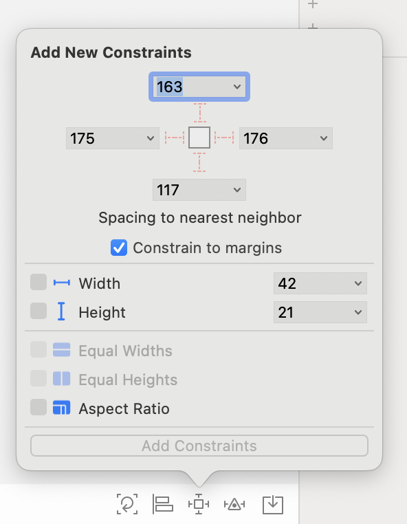
To add constraints using the Interface Builder we use the buttons at the bottom right.

These are called:
- Update frames
- Align
- Add new constraints
- Resolve Autolayout Issues
We can use Add new constraints to add constrains to the selected view. Remember that this constrains will be in relation to the closest object for the selected side of the object.
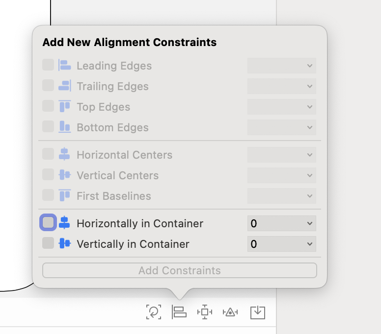
to center elements with respect to the super view, we can use Align.
Once these constraints are set, we can modify them by open the right panel and select Show the size inspector.

In this panel we can also modify the
HuggingandCompression.
Hugging and Compression#
When working with auto layout, there are two important concepts:
-
Content Hugging Priority: This controls how much a view likes to stick to its natural size. Higher priority = less likely to grow bigger than its content.
-
Content Compression Resistance Priority: This controls how much a view resists shrinking below its natural size. Higher priority = less likely to be squished.
Simply put, hugging stops a view from stretching too much, and compression resistance prevents it from getting squished too much.
Adjusting Priorities and Values#
-
Priority Values: Default values are 250 for content hugging and 750 for compression resistance. Adjusting these values can help achieve the desired behaviors in your UI.
-
Intrinsic Content Size: Some elements, like labels and buttons, have a natural size based on their content. Hugging and compression resistance help these elements maintain that size whenever possible. For example, a label with high compression resistance won’t shrink and cut off the text, while low compression resistance allows it to shrink and potentially truncate the text. A low content hugging priority allows the label to expand beyond the text’s size, while high content hugging priority keeps the label close to its content and prevents unnecessary expansion.
Handling Ambiguity and Conflicts#
-
Ambiguous Layouts: When auto layout can’t determine the final position or size of a view, you may see a warning about ambiguous layouts. To fix this, ensure all views have enough constraints to define their positions fully.
-
Conflicting Constraints: Conflicting constraints happen when two or more constraints contradict each other. For instance, a button cannot be both centered and anchored to a side. Resolve these by removing or adjusting constraints to eliminate conflicts.
Use Cases and Best Practices#
-
Adjusting Priorities: If you have a flexible view like a label next to a fixed-size view like an image, increase the label’s hugging priority to prevent unwanted expansion.
-
Avoiding Common Mistakes: Be careful not to over-constrain views. Over-constraint can lead to conflicts or unexpected resizing, so it’s best to only apply necessary constraints.
Assigning a ViewController to the Storyboard#
Having the storyboard is great, but we need to add code to make it function logically within our app. One way to do this is by associating a view controller with the storyboard.
-
Open the right panel in Xcode (
CMD + OPT + 0) and the Storyboard file. -
Select the View Controller Scene in the inner left panel.
-
On the right panel select Show Identity Inspector, here you will see a section called Custom Class, you add your reference in the Class section. Select any UIViewController class you want to connect to the storyboard and assign a Storyboard ID.

After adding the ViewController, you will end up with this. Now you can connect your elements in the storyboard to your ViewController and access their attributes and add actions as needed.
Don’t forget to add a Storyboard ID, we need this to reference it from objects in our code.

Linking Storyboard elements to ViewController#
There are several ways of linking the UI elements in the Storyboard to a particular View Controller.
Here is one simple approach with CONTROL + Drag.
CONTROL + Dragmeans you should move your cursor (using your mouse, trackpad, or other input device) to the file on the right while you’re pressing theCONTROLkey on your keyboard.
- Open the Storyboard file.
- On the up right side click on
Adjust Editor Options. - Select
Assistant Layout(CONTROL + OPTION + CMD + ENTER). CONTROL + Dragthe UI elements to the code.
Here is a video showing the whole process.
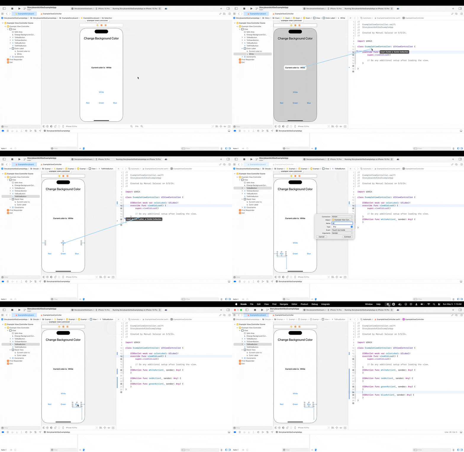
Finally you can add the logic in the View Controller. For this example we have a button that changes the background color and updates the label with the selected color.
import UIKit

class ExampleViewController: UIViewController {

    @IBOutlet weak var colorLabel: UILabel!

    override func viewDidLoad() {
        super.viewDidLoad()
    }

    private func updateScreen(with color: UIColor) {
        view.backgroundColor = color
        colorLabel.text = color.accessibilityName
    }

    @IBAction func whiteAction(_ sender: Any) {
        updateScreen(with: .white)
    }

    @IBAction func redAction(_ sender: Any) {
        updateScreen(with: .red)
    }

    @IBAction func greenAction(_ sender: Any) {
        updateScreen(with: .green)

    }

    @IBAction func blueAction(_ sender: Any) {
        updateScreen(with: .blue)
    }
}
Accessing the UI element in the View Controller#
Interactive Elements#
To access interactive UI elements declared in the storyboard from the view controller, we have two options:
- Using an
IBOutletreference. - Using an associated
IBAction.
If we want to use the associated action, we can cast the received sender to the appropriate UI type. Here’s an example with a button.
@IBAction func greenAction(_ sender: Any) {
        guard let button = sender as? UIButton else { return }
        print(button.titleLabel?.text ?? "No title label found")
        updateScreen(with: .green)

    }
We can do this with all UI elements that support interactivity via @IBAction.
The
IBActionmechanism is designed specifically to handle user-triggered events, which usually means interactive controls like buttons, sliders, switches, etc.
List of interactive UIElements#
- UIButton: Supports touch events like tapping and can be connected to IBAction for touchUpInside, touchDown, etc.
- UISwitch: Can trigger an IBAction when its on/off state changes.
- UISlider: Sends an action when its value changes due to user interaction.
- UISegmentedControl: Triggers an action when the selected segment changes.
- UIDatePicker: Triggers an action when the selected date changes.
- UITextField: Supports actions like editingDidEnd or editingChanged.
- UIPageControl: Triggers an action when the current page index changes.
- UIRefreshControl: Triggers an action when the user initiates a refresh in a scroll view.
- UINavigationItem and UIBarButtonItem: Both can have actions assigned via IBAction to handle navigation or toolbar events.
Non interactive element#
To access non-interactive elements, we need to use their IBOutlet reference inside the view controller.
To add actions for these elements, we can use a UITapGestureRecognizer.
In this example, the view controller has a reference to a label in the storyboard via IBOutlet, and we can add the following code to enable interactivity.
class ExampleViewController: UIViewController {

    @IBOutlet weak var colorLabel: UILabel!

    override func viewDidLoad() {
        super.viewDidLoad()
        addTapActionToLabel() // Add this function call
    }

    // More code

    // Add this function
    private func addTapActionToLabel() {
        let tapGesture = UITapGestureRecognizer(target: self, action: #selector(labelTapped))
        colorLabel.addGestureRecognizer(tapGesture)
        colorLabel.isUserInteractionEnabled = true
    }

    // Add this function
    @objc func labelTapped() {
        print("Label tapped!")
    }

    // More code
}
The IBOutlet mechanism is designed specifically to link UI elements, such as labels, buttons, and image views, to properties in your code, enabling you to access and modify these components programmatically after connecting them via a storyboard or Xib file.
List of non interactive UI elements#
- UILabel: Displays static or dynamic text but doesn’t respond to user interactions on its own.
- UIImageView: Shows images but isn’t designed to respond to taps or other gestures directly.
- UIView: A base view class that serves as a container for other elements and doesn’t have direct user interaction methods.
- UIStackView: Arranges child views in a horizontal or vertical stack but doesn’t have built-in user-triggered events.
- UITableViewCell: The individual cells in a table view that respond to user interaction only through their parent table view.
- UICollectionViewCell: Similar to table view cells, these collection view cells interact through the parent collection view.
Instantiating Storyboards from another View Controller#
To instantiate programmatically a storyboard from another class we can follow the next approach.
To achieve this we need two pieces of information, the name of the storyboard file and the Storyboard ID. We use the first element in UIStoryboard and the second element in storyboard.instantiateViewController.
We can present or push the final object, in this example we are pushing the storyboard as a modal.
// A different view controller that will instantiate the storyboard
class ViewController: UIViewController {

    // More code

    override func viewDidAppear(_ animated: Bool) {
        presentStoryboard()
    }

    func presentStoryboard() {
        let storyboard = UIStoryboard(name: "ExampleStoryboard", bundle: nil)
        if let exampleViewController = storyboard.instantiateViewController(withIdentifier: "ExampleSB") as? ExampleViewController {
            present(exampleViewController, animated: true, completion: nil)
        }
    }

    // More code

}
Here is a small example of the resulting presentation.
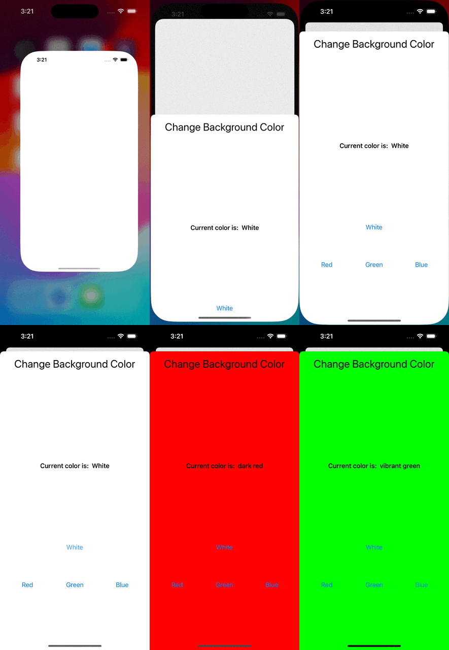
Working with Xibs#
Working with Xibs is similar to working with Storyboards, so this section will feel familiar to the Storyboard section.
Creating Xibs#
With an associated View Controller#
One simple way to create a Xib is during the creation of a View Controller.
Inside an open Xcode project press CMD + N to open the template window.
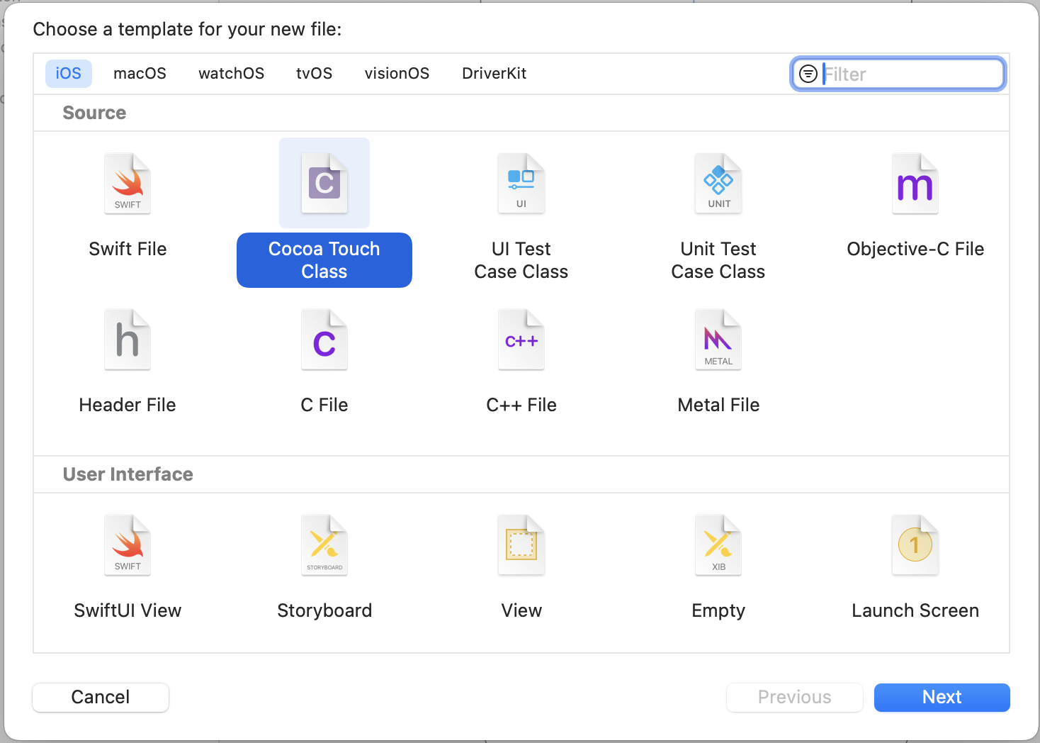
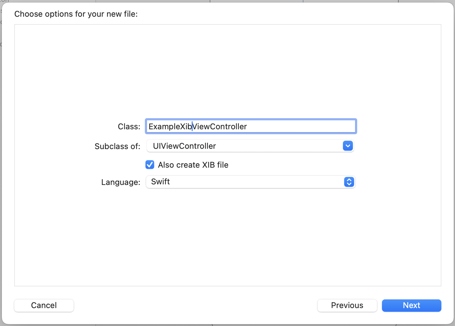
Then give it a name and check the box Also create XIB file.
After pressing Next, select a directory to create the files and check the target and group are correct.
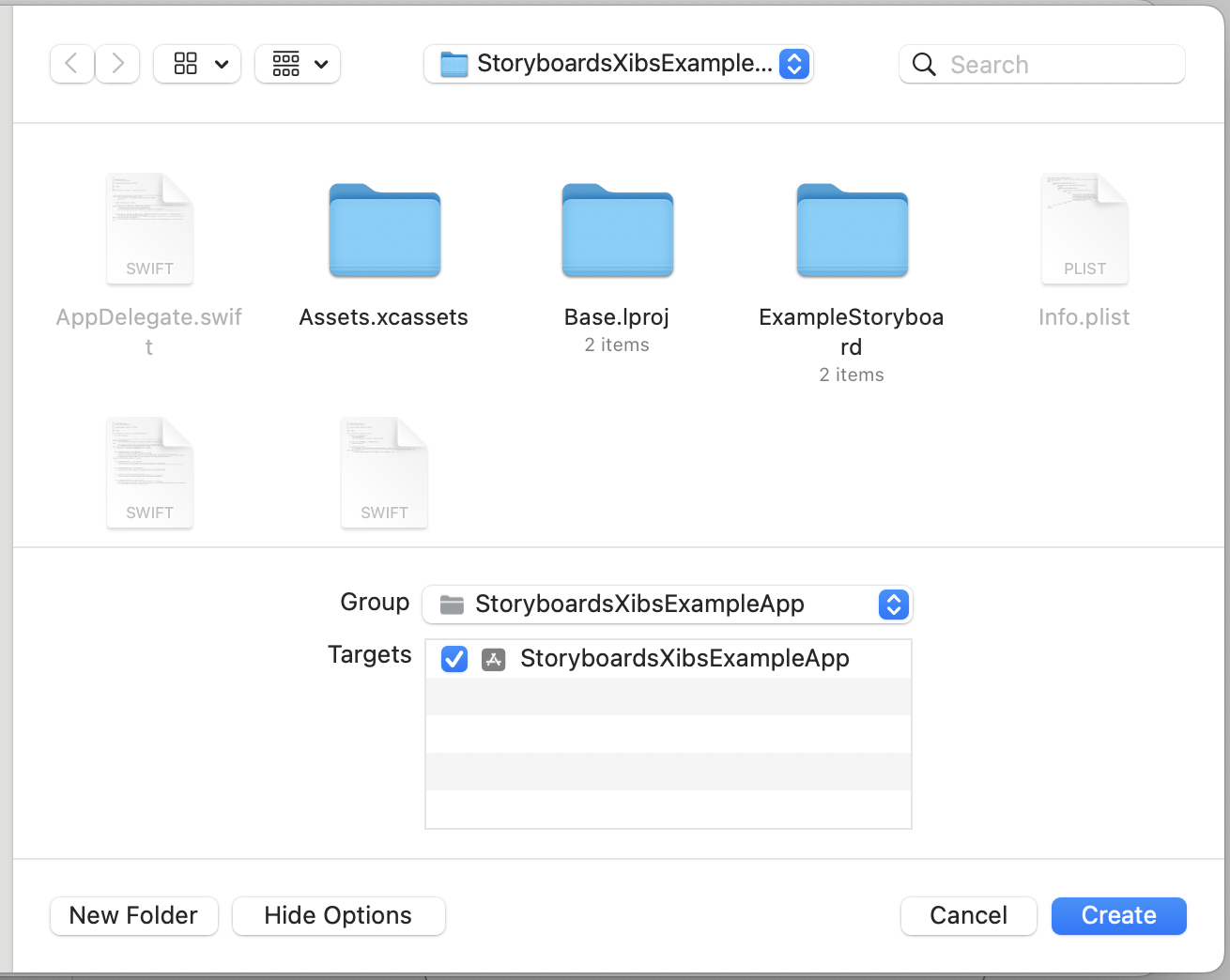
Now two files will be created, the Xib and the View Controller class.

These two files are now linked by default, so you can add IBActions and IBOutlets in your custom controller class to add some logic to the Xib.
Simple example to control the Xib objects from code#
Let’s add and connect the following elements to the Xib. You can add the constrains as you like.
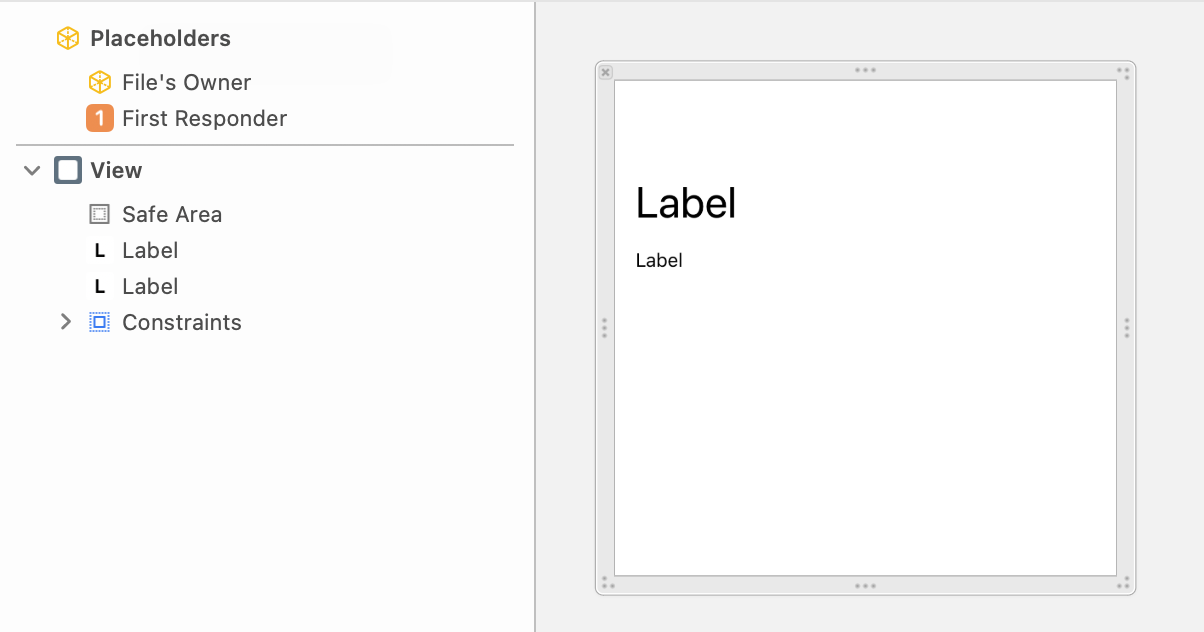
Then let’s add some IBOutlet to the preconfigured UIViewController subclass (this process is the same as with the Storyboard, you can refer it here).
class ExampleXibViewController: UIViewController {
    @IBOutlet weak var titleLabel: UILabel!
    @IBOutlet weak var subheadingLabel: UILabel!

    override func viewDidLoad() {
        super.viewDidLoad()
        titleLabel.text = "Awesome Xib Example"
        subheadingLabel.numberOfLines = 0
        subheadingLabel.text = "Learning how to integrate Xibs on your programmatic projects."
    }

}

#Preview(traits: .sizeThatFitsLayout) {
    ExampleXibViewController()
}
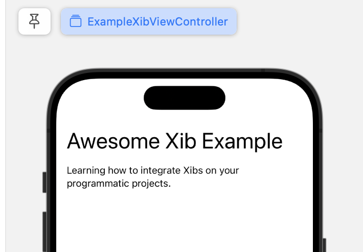
Now you can see how the Xib is loaded automagically (this works because both files have the same name and the Xib was autoconfigured to have this class as its file owner) and thanks to the IBOutlet you can manage their state and actions using the references in the code.
Individually#
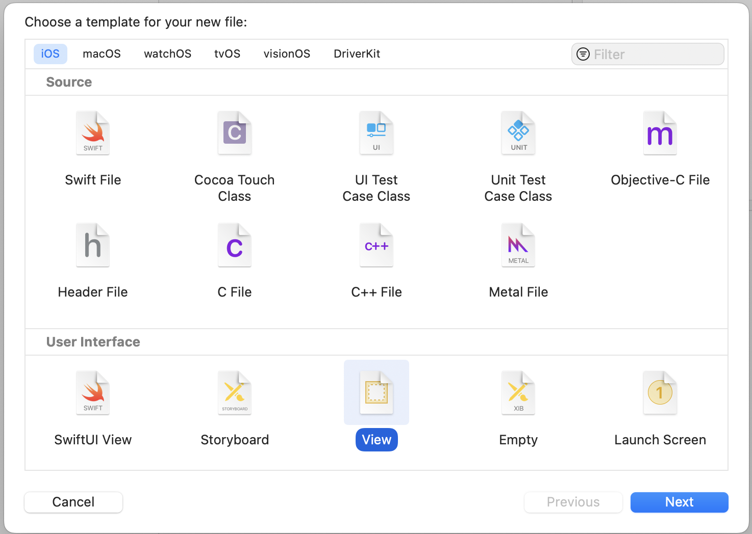
To create an individual Xib file, press CMD + N and select either View or Empty.
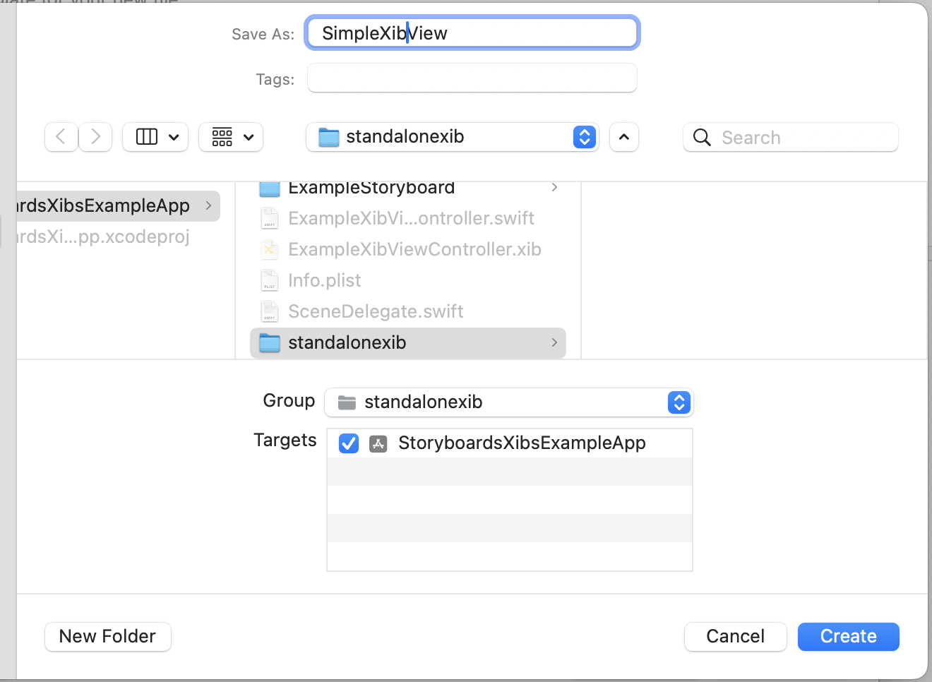
Finally, we give a name, check the correct group and target, and press Create.
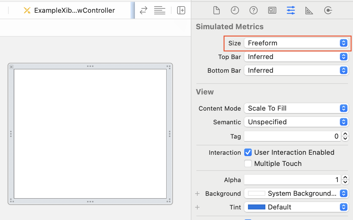
Change Xib visual interface to freeform#
By default Xib interface resembles an iPhone screen, sometimes we are creating a View that will act as a component, in these cases having the iPhone layout is not the best idea.
To change to a freeform layout we can do the following
- Open the right bar
CMD + OPC + 0. - In the right bar, select
Show the attribute inspector. - Under
Simulated metricsselectsize. - In the
sizemenu selectFreeform. - Optional, change the dimensions of your Xib to your liking.
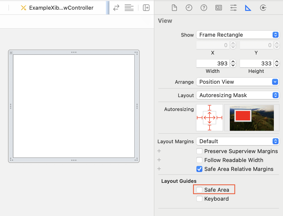
Disable Safe Area for Freeform Xibs#
If we are using our Xibs as a component to the final screen, we may not want to have Safe area on by default, to turn it off we can do the following:
- Open the right bar
CMD + OPC + 0. - In the right bar, select
Show the size inspector. - Under
Layout GuidesuntickSafe Area.
Adding constraints to Xibs#
This works the same as adding constraints to Storyboards, you can refer to that section here.
Connecting Xibs to Classes#
Individual Xibs can be connected to Classes to add some logic to them.
We are covering these cases:
- Connecting to
UIViewsubclass. - Connecting to
UIViewControllersubclass. - Connecting to
UITableViewCellorUICollectionViewCellsubclasses.
Connecting to UIView subclass#
We can bind a Xib with a UIView subclass, this process is a tad complicated than binding with UIViewControllers.
First, let’s create the UIView subclass we are going to bind to the Xib.
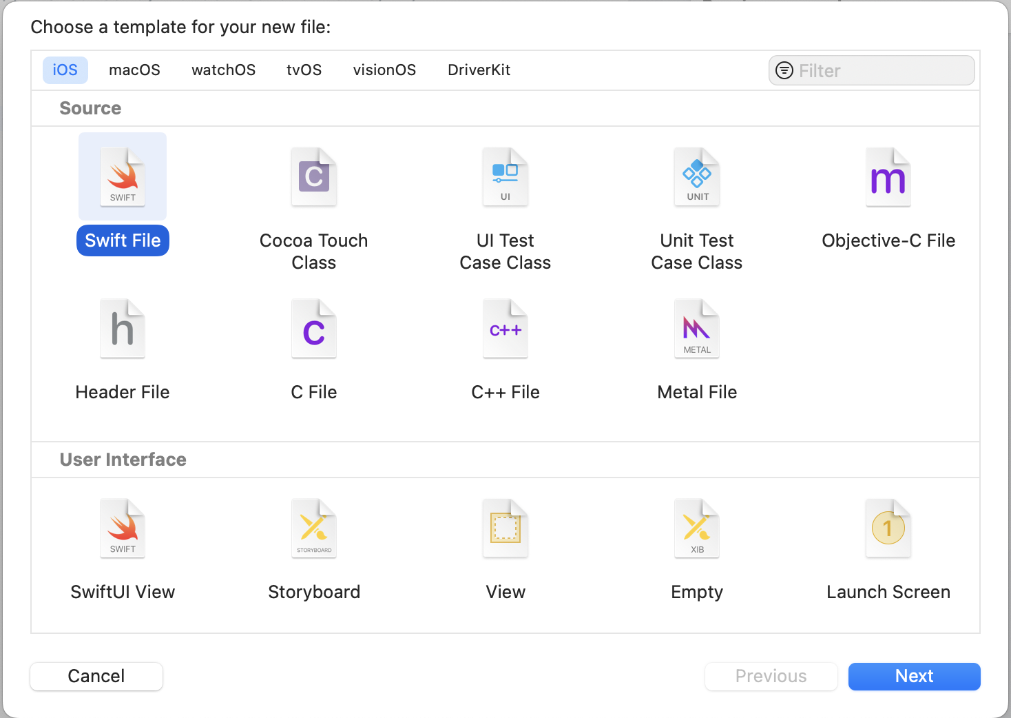
- Press
CMD + Nand select Swift File.
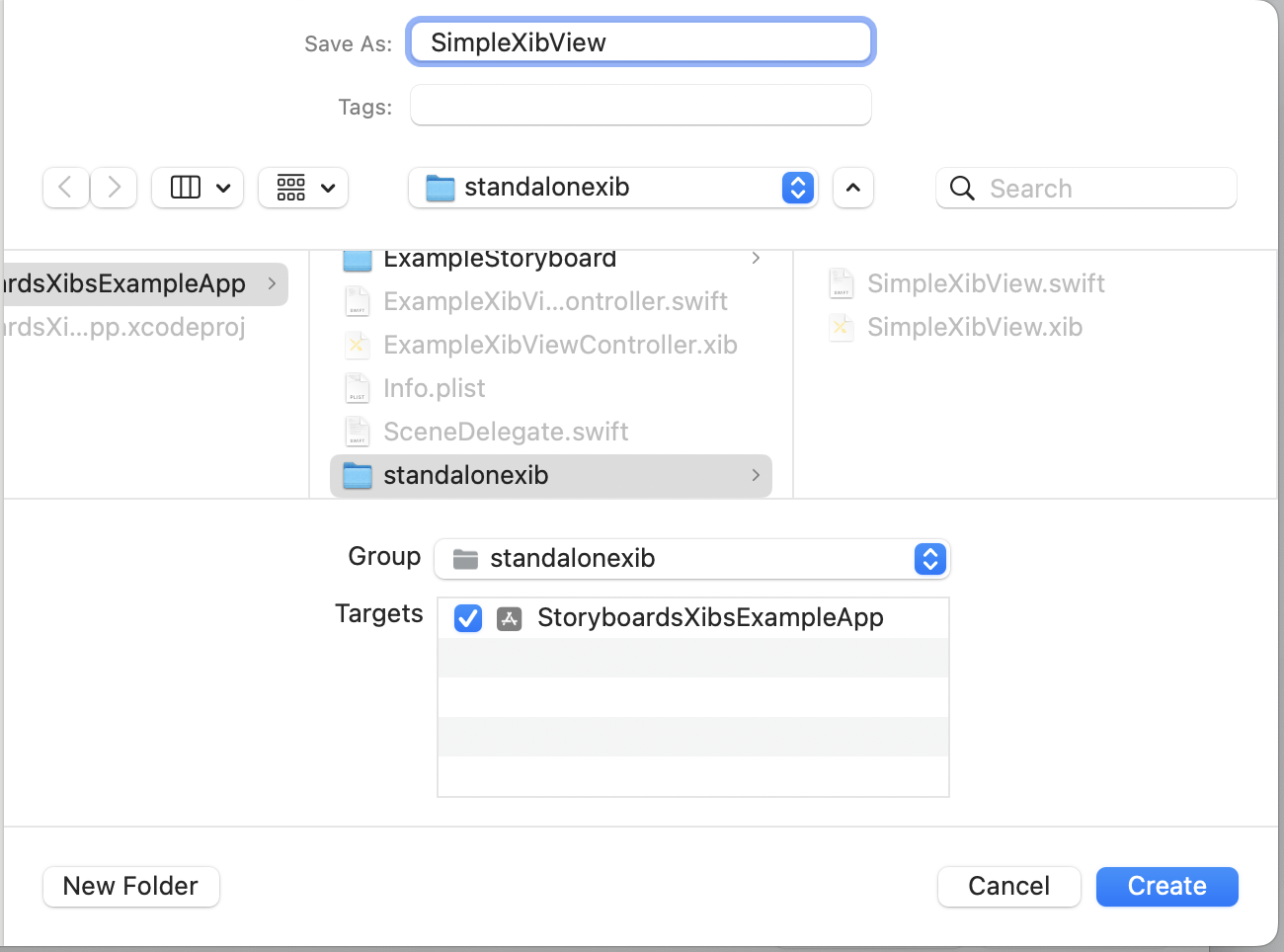
- Give it a name and be sure to add it to the right group and target, press create.
- Create the class by adding the following code to the new created file.
import UIKit

class SimpleXibView: UIView {

    override init(frame: CGRect) {
        super.init(frame: frame)
    }

    required init?(coder: NSCoder) {
        fatalError("init(coder:) has not been implemented")
    }

}

#Preview(traits: .sizeThatFitsLayout) {
    SimpleXibView(frame: CGRect(x: 0, y: 0, width: 100, height: 100))
}
- Assign this class as the
File's Owner

- Add the nib load method to the
UIViewcustom class.
We use this method to load the Xib with the same name as our
UIViewclass, if your Xib has a different name update the method accordingly.
private func loadFromNib() {
        guard let view = Bundle(for: type(of: self)).loadNibNamed(String(describing: type(of: self)), owner: self, options: nil)?.first as? UIView else { return }
        view.frame = self.bounds
        view.autoresizingMask = [.flexibleWidth, .flexibleHeight]
        self.addSubview(view)
    }
- Call the method in the
initto load the Nib, your class should look like this.
import UIKit

class SimpleXibView: UIView {

    override init(frame: CGRect) {
        super.init(frame: frame)
        loadFromNib()
    }

    required init?(coder: NSCoder) {
        fatalError("init(coder:) has not been implemented")
    }

    private func loadFromNib() {
        guard let view = Bundle(for: type(of: self)).loadNibNamed(String(describing: type(of: self)), owner: self, options: nil)?.first as? UIView else { return }
        view.frame = self.bounds
        view.autoresizingMask = [.flexibleWidth, .flexibleHeight]
        self.addSubview(view)
    }

}

#Preview(traits: .sizeThatFitsLayout) {
    SimpleXibView(frame: CGRect(x: 0, y: 0, width: 100, height: 100))
}
- Preview the Nib on the Canvas!
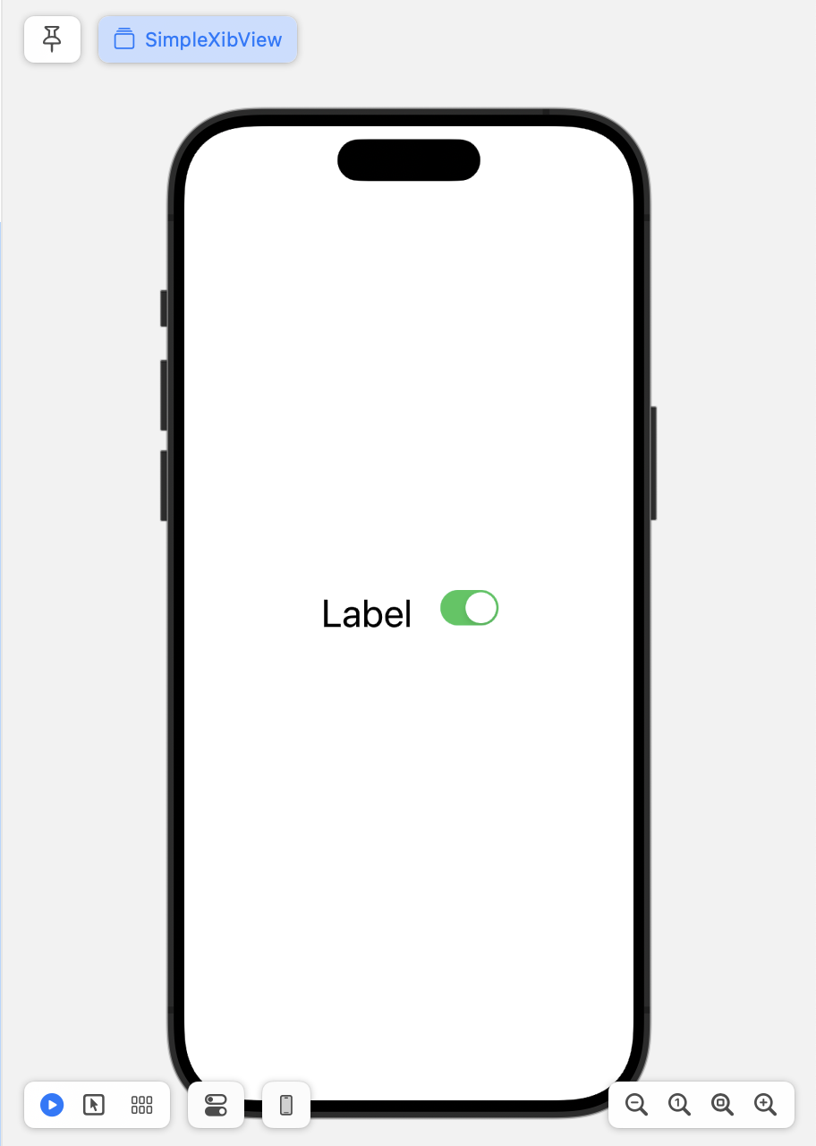
Now you have linked your Xib with a custom UIView subclass.
You can add IBOutlet or IBAction to manage the logic of your View. This mechanism doesn’t change from how we did it with Storyboards, here you can find out more.
Connecting to UIViewController subclass#
Xibs are easy to connect to UIViewController.
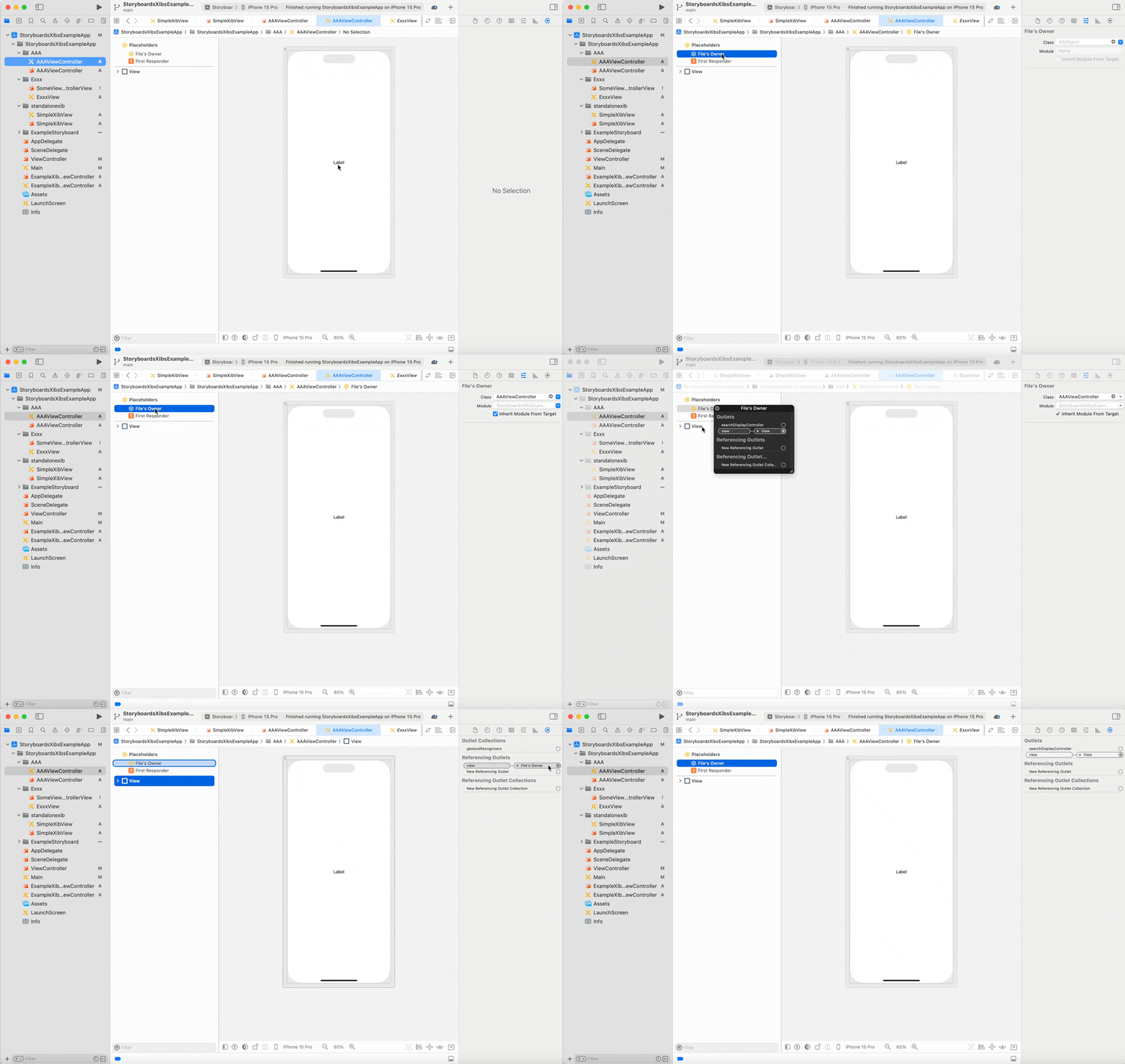
- Assign the
File's Ownerto the desire custom class. CONTROL + CLICKonFile's Ownerand drag view to the view object on screen.
The
viewproperty of theFile's Owneronly appear if the assigned class is a subclass ofUIViewController.
Here is a video showing the process.
Connecting to UITableViewCell or UICollectionViewCell subclasses#
Working with tables deserves a separate entry, but to finish Xibs let’s give the steps needed to create and link cells.
-
Create the Xib File: In Xcode, right-click on the project navigator, select “New File…”, choose “View” under the User Interface section, and name the Xib after the cell it represents, like
CustomTableViewCell.xib. -
Design the Interface: Open the Xib file, drag a
UITableViewCellorUICollectionViewCellfrom the object library onto the canvas, and add UI elements like labels, images, buttons, etc. -
Create the Cell Subclass: Create a new Cocoa Touch Class, subclass
UITableViewCellorUICollectionViewCellasCustomTableViewCell, then go back to your Xib file, select the cell, and set the class toCustomTableViewCellin the Identity Inspector. -
Connect Outlets: With the Xib file and the Assistant Editor open (showing
CustomTableViewCell.swift), Ctrl-drag from the UI elements in the Xib to the class file to create outlets and actions. -
Register the Xib with the Table or Collection View: In your view controller’s
viewDidLoad()method, register the Xib withlet nib = UINib(nibName: "CustomTableViewCell", bundle: nil)andtableView.register(nib, forCellReuseIdentifier: "CustomCellIdentifier")forUITableView, or similar steps forUICollectionView.
Conclusion#
In this blog entry, we’ve embarked on a comprehensive exploration of Xibs and Storyboards within Xcode, unraveling their functionalities and best practices to enhance our iOS development skills. By dissecting their definitions and diving into practical implementation scenarios, we’ve equipped ourselves with the knowledge to effectively utilize these tools in creating both complex and component-specific user interfaces.
The step-by-step guides provided will serve as a valuable reference for integrating Xibs and Storyboards into your projects, ensuring you can confidently handle layout constraints, link UI elements to code, and streamline your development process. Whether you’re crafting a single view or orchestrating an entire app’s flow, the insights shared here aim to bolster your proficiency and creativity in using these powerful features of Xcode.
As we continue to evolve our skills in the iOS development landscape, let’s leverage the flexibility and functionality of Xibs and Storyboards to create more dynamic, efficient, and visually compelling applications when working with UIKit.